Sleuth Stats
Data Visualizing a Sleuther’s Life-line
THE CHALLENGE
A sleuther wants to know more about their own conversation insights on Websleuths. They are curious about their friend’s activity as well, in comparison to their own.
THE PROMPT
How can a visualization show user participation and activeness overall AND in a chosen forum over their course of life on websleuths.
Individual project focused on data visualization.
PROJECT TYPE:
2 weeks; August 2022
DURATION:
Microsoft excel
Adobe illustrator
Google slides
SOFTWARE USED:
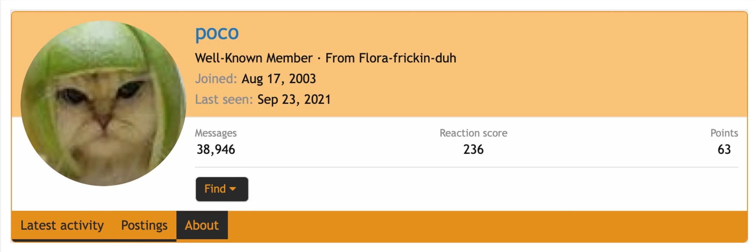
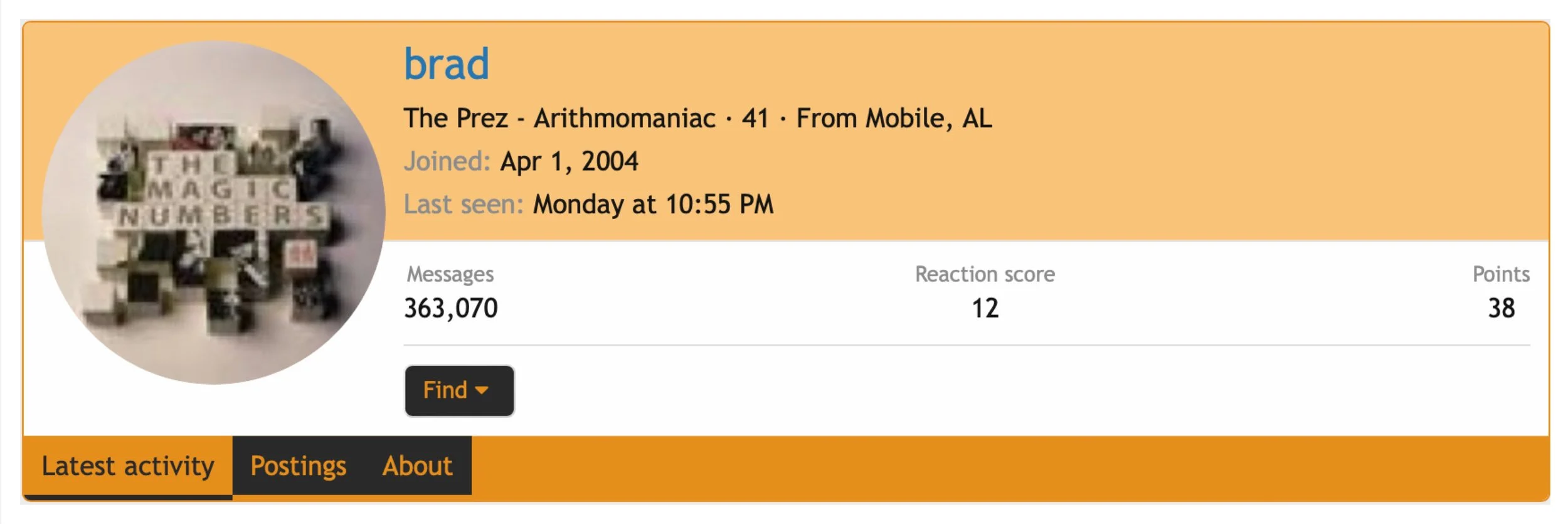
PERSONAS
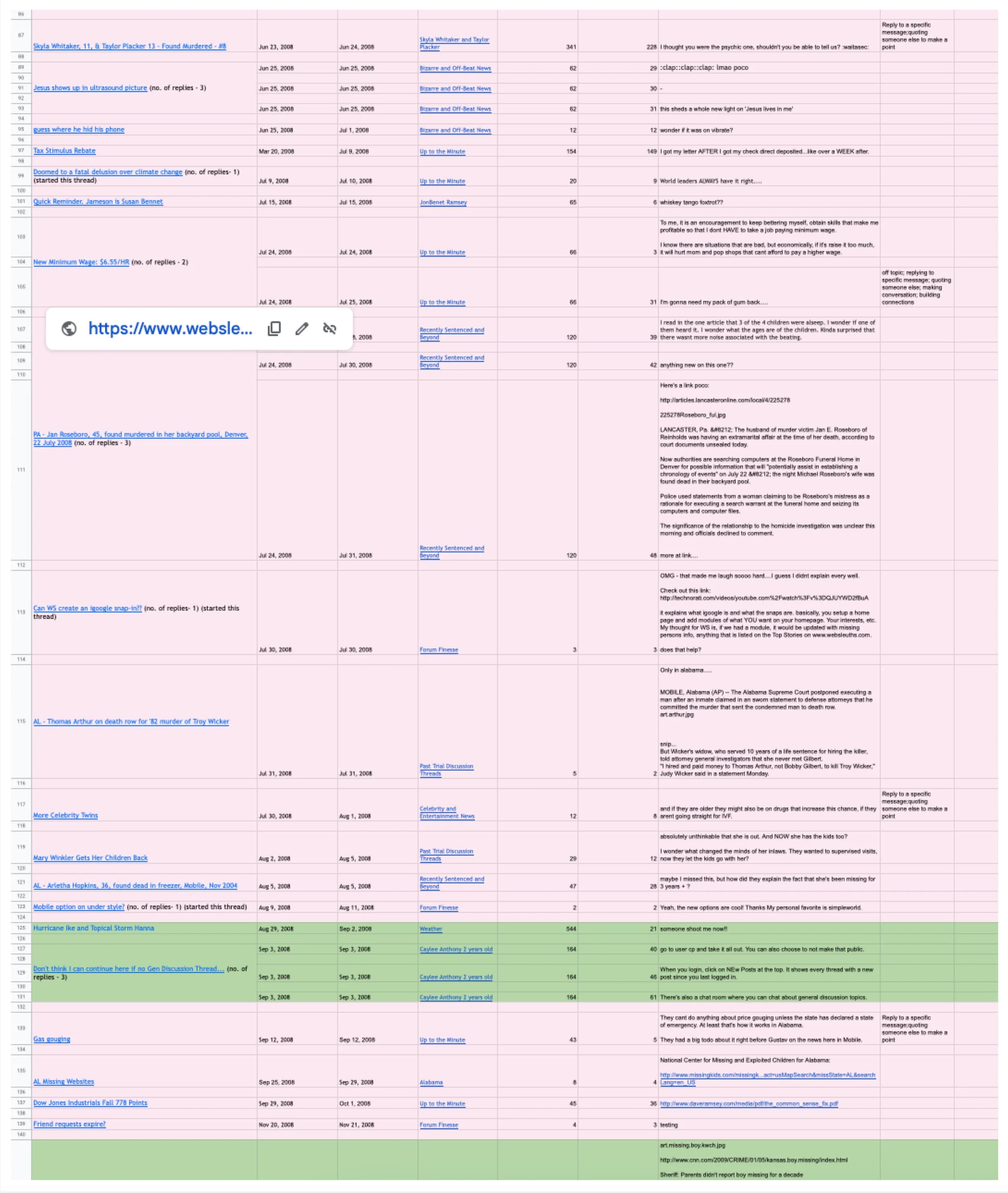
DATA COLLECTION
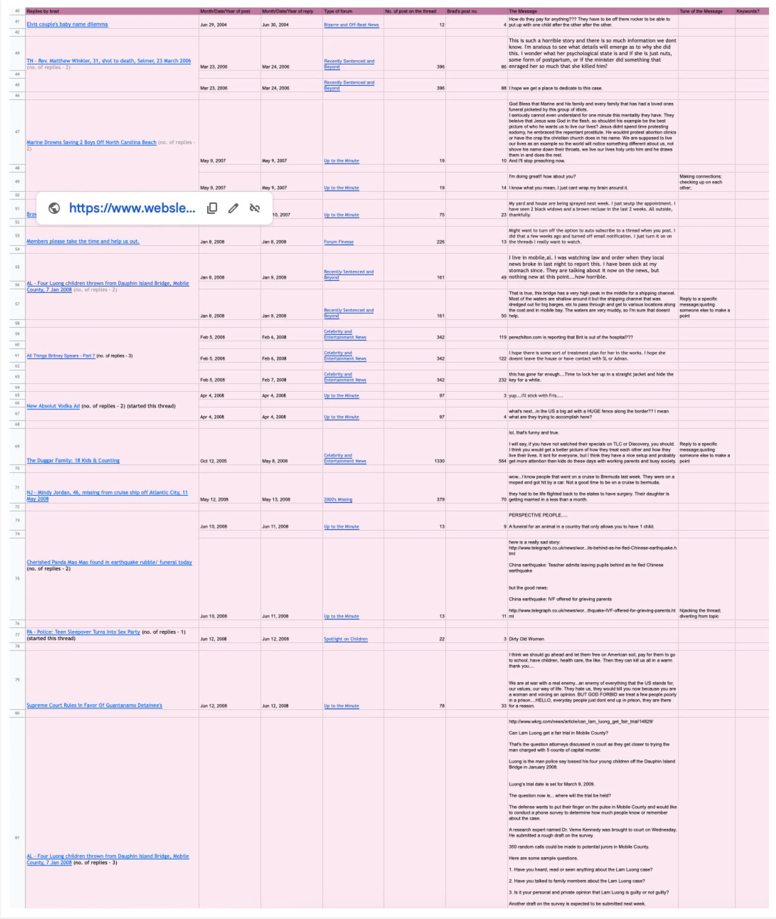
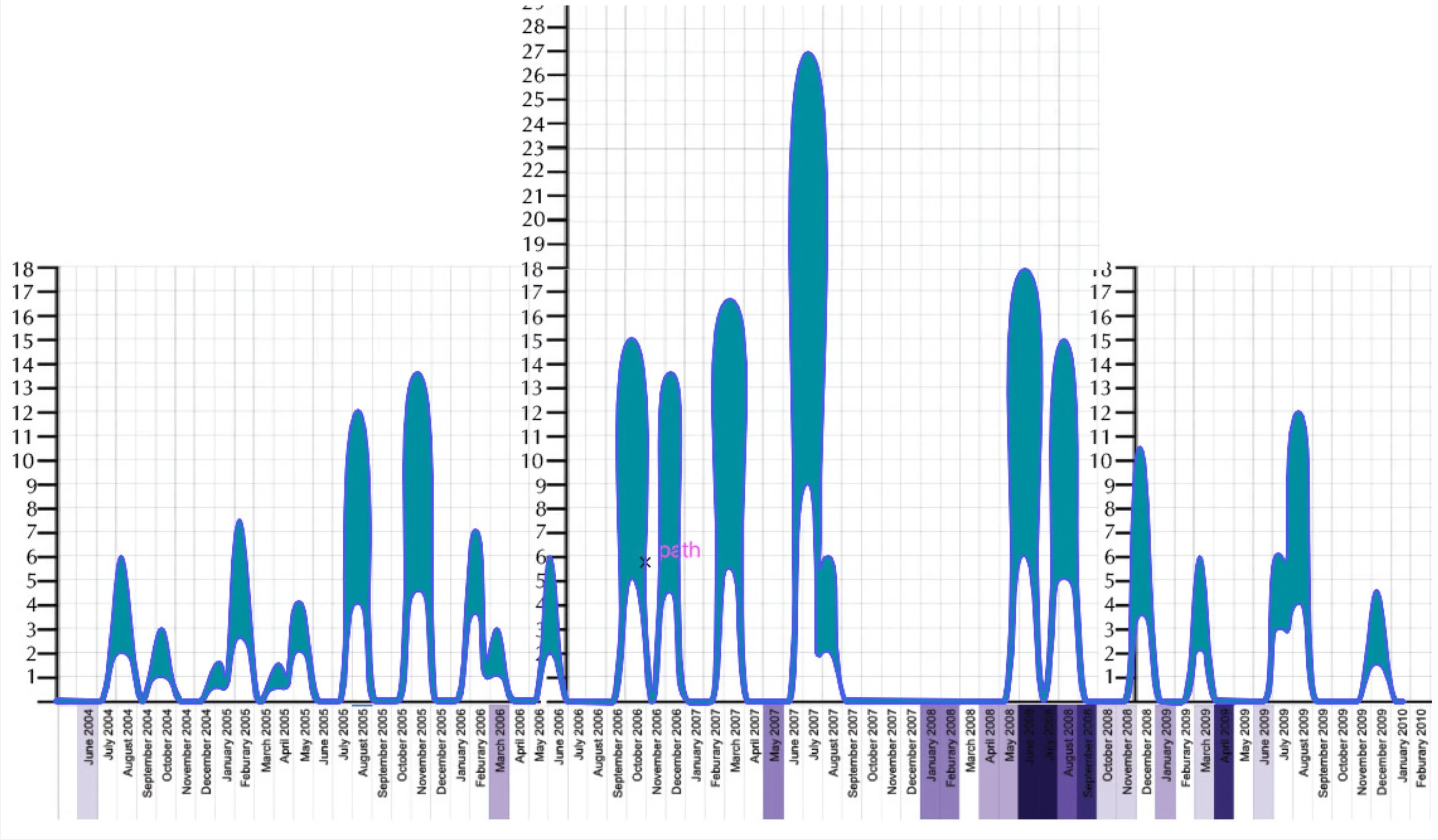
DATA MAPPING
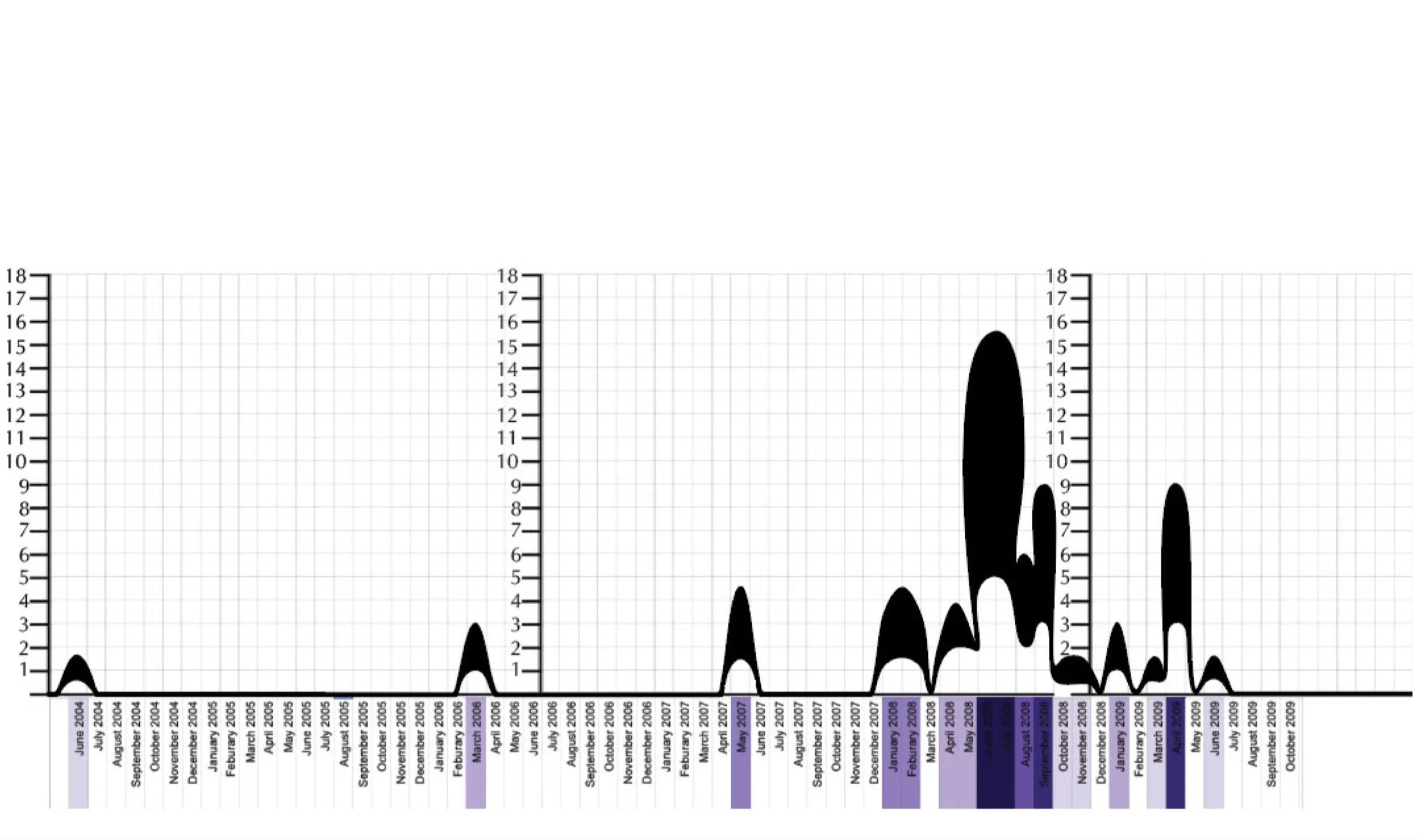
HEART RATE MONITORS